
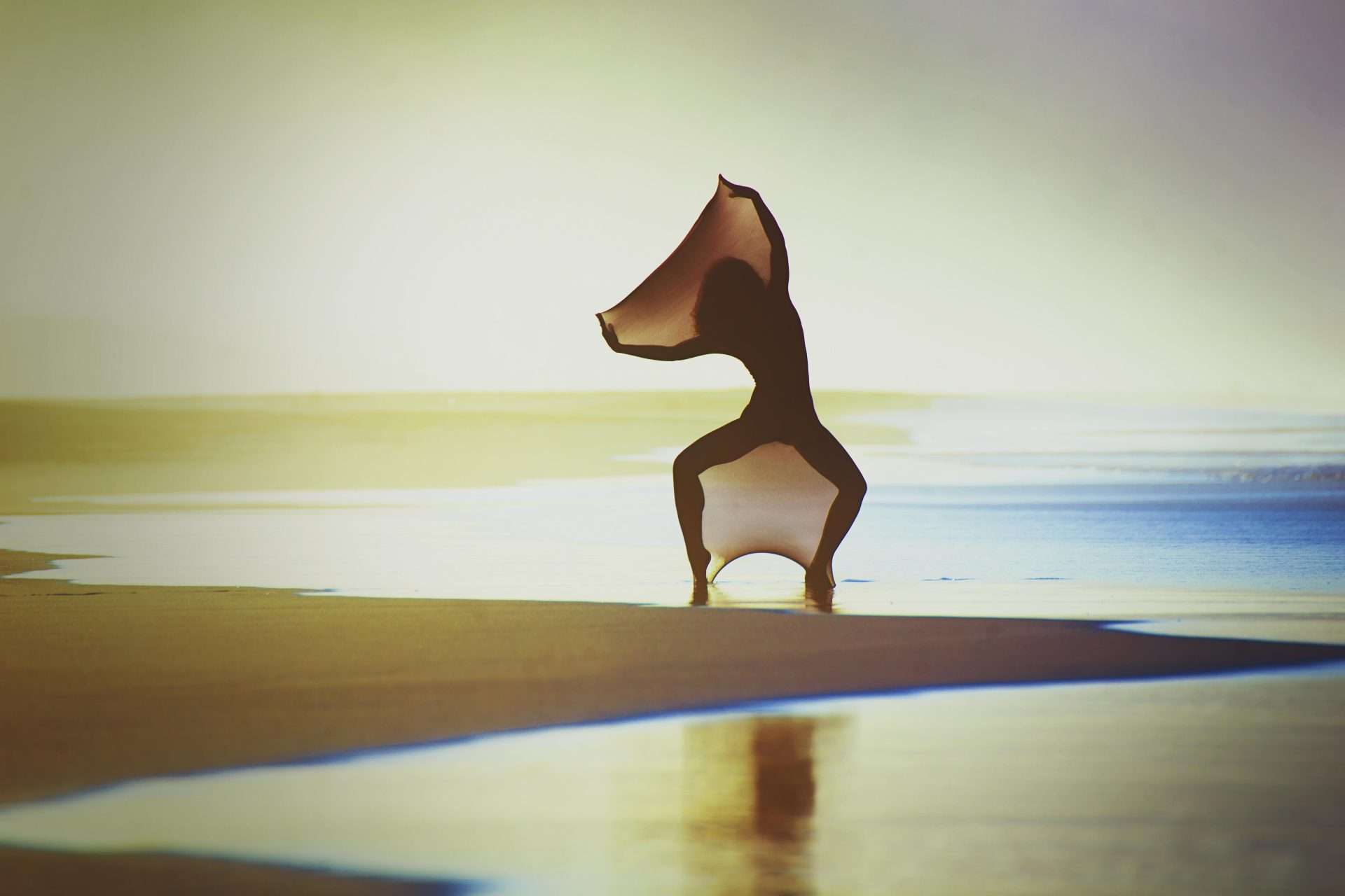
Written by Simone Angarano
Photos by Luca De Nardo
Composition is defined as the arrangement of various image elements within the frame. It is up to the photographer to choose the framing, the focal length or one shooting point over another and this can greatly vary the communication of an image.
Composition has its own rules and learning to put them into practice is not difficult. With the advent of digital we can take many shots by varying the composition and then evaluate its effectiveness later.
We will look at some basic techniques below.
 Filling the Frame
The first rule for good composition is to fill the frame using the subject. This will give the image a greater visual impact. Regardless of the type of lens you use, wide angle or tele, it is always the subject that should dominate the image area.
Rule of thirds
This rule was stated by Leonardo da Vinci in the 16th century and consists of dividing a square or rectangle into thirds, in both directions, and then placing the point of interest at one of the intersections. This will make the composition more effective.
The intersections that are created are called Strengths.
To improve the ‘readability’ of an image by applying the rule of thirds, you must keep in mind that the fewer the points of interest, the better the result. According to the theory of composition, in a good shot there should only be one or two points of interest, obviously placed at one of the intersections of the grid.
I remind you that this method should not be binding on your choices but should serve as a guideline. In most cases this will help you create dynamic and balanced images.

The horizon in the frame
Used mainly in landscapes it is often used by keeping the line right in the centre of the image, but to give emphasis and balance to the composition the rule of thirds can be applied. This theory holds that the horizon line appears at the top or bottom of the frame, in which case it will increase dynamism. To decide where to place the horizon, simply assess which part of the scene is most important to you.
The Fifth Effect
In practice, elements that act as a backdrop are used both horizontally and vertically. Shooting through something such as a door, a window, a branch frames the image by limiting its field of view and draws attention to the subject. This is also the easiest way to create a perspective effect by giving the image a sense of greater depth. Thus, the elements that act as a backdrop are used to create a frame within the frame and direct the viewer’s gaze towards the main subject. Furthermore, the elements of the backdrop can appear both in focus and out of focus. Using a medium telephoto will result in more blurred fifths while using a wide-angle lens the greater depth of field will make them appear more in focus. As a basic concept for the sense of depth, if the fifth is just hinted at then it is better for it to be slightly out of focus, whereas if it is present in full focus it is preferable for it to be sharp.
 Distraction elements
These are defined as those objects, extraneous to the scene, that divert attention from the subject or disturb it with their presence. Obviously, the first rule to avoid trivial mistakes is to study the portrayed scene very well, concentrating on the viewfinder area. Anything that can divert the eye should be cut out, remembering that the subject must always be recognisable beyond doubt.
Another technique is to blur any disturbing elements that are in the background of the subject.
Lines, Shapes, Colour
The visual elements that a photographer must look for are: lines, shape, pattern and colour. Every photograph contains at least one of these elements irrespective of the subject that give the image a strong symbolic value.
Lines can symbolise wisdom such as the wrinkles carved into an elderly person’s face, or fear such as the lines of broken glass. Each of us unconsciously attaches these values. Learning to recognise them will help you make the most of them.
 Shapes are the outline of a two-dimensional object; the main ones are circle, square and triangle, in photography they can be used to create an effect of stability, strength or stillness. In addition, the observer’s eye is always looking for a point to rest on and a bold shape draws attention.
Colour is essential for the creation of images, each chromaticism has its own meaning that creates different emotional reactions. Colours can be harmonious or out of tune, warm, cold, bold or muted, sometimes even creating visual confusion. Learning to use and dose them skilfully requires technique and study.
In the next instalments of ‘Photo Unveiled’ we will explore this topic in more detail.


